
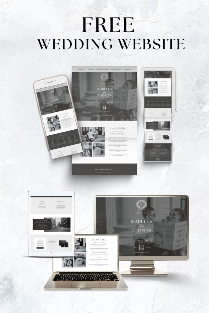
Your wedding website is one of the easiest ways to keep guests informed and organized in the lead-up to your wedding.
Instead of answering the same questions repeatedly, you can share key details in one place such as the schedule, venue information, RSVP instructions, and travel advice.
However, many couples unintentionally make their wedding website harder to use than it needs to be.
Small mistakes like missing important details, adding too much information, or making navigation confusing can leave guests searching for answers.
The best wedding websites are simple, clear, and focused on what guests actually need to know.
In this guide, we’ll look at the most common wedding website mistakes couples make and how to avoid them so your website is genuinely helpful for your guests.
The Biggest Wedding Website Mistakes Couples Make
Adding Too Much Information
One of the most common wedding website mistakes is trying to include too much. Many couples treat their website like a digital scrapbook, filling it with long stories, multiple pages, and lots of extra details.
While it is completely understandable to want to share your story and excitement, most guests are visiting your website for practical reasons. They usually want quick answers about the ceremony time, venue location, dress code, or how to RSVP.
When a website becomes overloaded with information, it can actually make it harder for guests to find what they need. Important details end up buried between long sections of text or scattered across too many pages.
A good wedding website focuses on clarity. Keep the structure simple and prioritize the information your guests need to attend and enjoy the day.
Forgetting the Most Important Details
At the opposite end of the spectrum, some wedding websites are missing the most important information entirely.
Couples sometimes assume guests already know the basics, especially if they have spoken about the wedding in person. In reality, guests often rely on the website as the main place to double check details.
Key information should always be easy to find. This includes the ceremony start time, the full venue address, the RSVP deadline, and the dress code.
Without these basics, guests may feel unsure about what to expect or end up messaging the couple with questions that could have been easily answered on the website.
The goal of a wedding website is to reduce confusion. If the essential details are clear and visible, guests can quickly find what they need without having to ask.
Not Making the Website Mobile Friendly
Most guests will view your wedding website on their phone rather than a computer. If the site is difficult to read on a smaller screen, important information can easily be missed.
Common issues include text that appears too small, pages that require excessive scrolling, or buttons that are hard to tap. Some couples also add large image blocks or complicated layouts that look good on desktop but feel cluttered on mobile.
A good wedding website should be easy to navigate on a phone. Keep sections simple, make sure text is readable, and check that key buttons like RSVP or directions are easy to find and tap.
Before sharing the site with guests, it is worth opening it on your own phone to make sure everything looks clear and functions properly.
Writing Very Long “Our Story” Sections
Many wedding websites include a section where couples share how they met or their journey together. This can be a lovely personal touch, but it often becomes far longer than guests expect.
When the story turns into several long paragraphs, many guests simply skip it. The problem is that important information sometimes sits nearby on the page, meaning it may be missed as well.
A short and thoughtful story is usually more effective. A few sentences about how you met or a brief highlight of your relationship is enough to add personality without overwhelming the page.
Keeping this section concise helps maintain the balance between sharing something meaningful and keeping the website easy for guests to use.
Not Updating Information When Plans Change
Wedding plans often change during the planning process. Timelines shift, venues update policies, accommodation suggestions change, or transportation plans are adjusted.
If the wedding website is not updated when these changes happen, guests may end up relying on outdated information. This can lead to confusion, late arrivals, or unnecessary questions.
Your website should always reflect the most current details. If anything important changes, it is a good idea to update the relevant section straight away so guests are always seeing the correct information.
Treat the wedding website as the central place for accurate updates, especially as the wedding date gets closer.
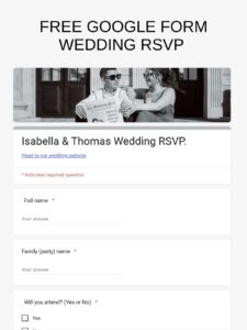
Making the RSVP Process Confusing
The RSVP section is one of the most important parts of a wedding website, but it is surprisingly easy to make it confusing without realizing.
Some couples forget to clearly label the RSVP button, place it in a hard to find section, or require guests to complete overly complicated forms. Missing RSVP deadlines can also cause problems, leaving guests unsure about when they need to respond.
A good RSVP system should be simple and obvious. Guests should be able to find the RSVP button quickly, understand exactly what information is required, and clearly see the response deadline.
The easier the process is, the more likely guests are to respond on time.
Forgetting to Add Helpful Guest Information
Another common mistake is leaving out practical information that guests often need.
Details such as parking instructions, transport options, accommodation suggestions, and dress code clarification can make a big difference for guests trying to plan their day.
Without this information, guests may end up messaging the couple individually with questions that could have been answered on the website.
Adding a small section dedicated to guest logistics helps everyone feel more prepared and reduces the number of last minute questions you receive.
Hiding Important Information in Too Many Pages
Some wedding websites include many separate pages and sections, which can make the site feel organized at first. However, this can quickly become frustrating for guests if important information is difficult to find.
Guests should not have to click through several different pages just to locate the venue address, schedule, or RSVP link.
The most important details should be easy to find within the main navigation or clearly visible on the homepage.
Keeping the structure simple helps guests quickly access the information they need without having to search through the entire website.
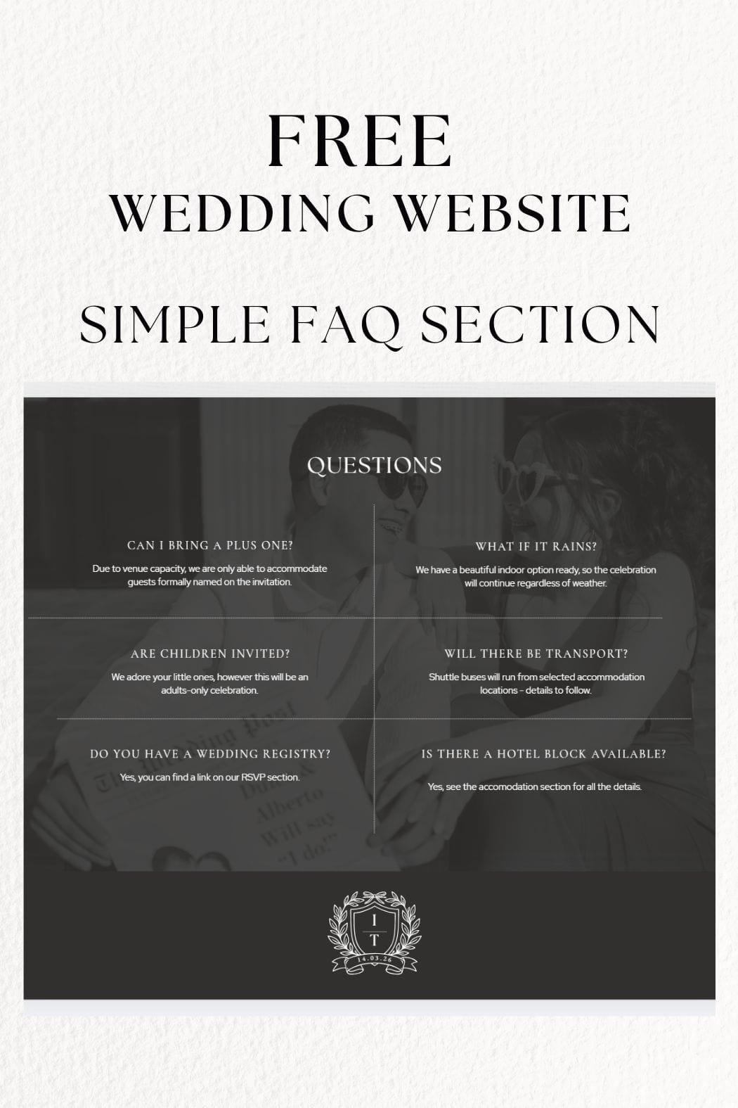
Not Adding an FAQ Section
Many couples underestimate how useful an FAQ section can be on a wedding website. Without one, guests often end up messaging the couple with the same questions repeatedly.
A simple FAQ page allows you to address common concerns in one place. This might include whether guests can bring a plus-one, if children are invited, what the dress code means, or whether the ceremony will be unplugged.
It can also help answer practical questions such as what happens if the weather changes, especially for outdoor weddings.
Adding a short FAQ section helps guests feel more prepared while saving you from answering the same questions over and over. Check out this post for FAQ examples.
Waiting Too Long to Launch the Website
Another common mistake is waiting too long to publish the wedding website.
Ideally, the website should be ready before save-the-dates are sent so guests have somewhere to find information straight away. Even if every detail is not finalized yet, the main basics can still be shared.
Guests often visit the website soon after receiving their save-the-date to check the location, date, and early travel details. Without a website available, they may not know where to look for updates.
Launching the website early gives guests a central place to check information as plans develop and helps reduce confusion later in the planning process.
How to Create a Wedding Website Guests Actually Use
The best wedding websites are simple, clear, and designed with guests in mind. While it can be tempting to include lots of pages, photos, and detailed stories, the most effective websites focus on helping guests quickly find the information they need.
Think of your wedding website as a practical guide to your celebration. Guests should be able to easily locate key details such as the schedule, venue location, dress code, accommodation suggestions, and RSVP instructions without having to search through multiple sections.
Clear navigation, short sections of text, and well organized pages make a big difference. When guests can quickly find answers, they are more likely to use the website instead of sending messages to ask for information.
A wedding website does not need to be complicated to work well. When it is structured around guest needs rather than extra details, it becomes a genuinely helpful tool for everyone attending your wedding.
Free Wedding Website Checklist
If you want to make sure your wedding website includes everything guests actually need, a simple checklist can make the process much easier.
This free Wedding Website Checklist walks you through exactly what to include so nothing important gets missed. It covers the essential sections most couples need, from your core wedding details and RSVP setup to helpful guest information like travel, accommodations, and FAQs.
Instead of guessing what to add or worrying you have forgotten something, you can simply work through the checklist step by step as you build your site.
Below you can see a preview of the checklist and how it is organized.
The download includes a printable version you can use while planning, along with an editable option if you prefer to customize it digitally while building your website.
More blogs you will love!
- 10 Things Every Modern Wedding Website Needs

- How to Set Up Wedding RSVPs Google Forms (Free Template Included)
- The Easiest Way to Create a Free Wedding Website (Free Template)
- Free Wedding Planning Checklist Bundle

- The Ultimate Bridesmaid Packing List: With Free Checklist

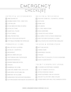
- The Ultimate Wedding Day Emergency Kit Checklist: Be Prepared for Anything
- Bridal Suite Checklist: What to Put in Your Getting-Ready Room (+ Free Printable)

- 48 Hidden Wedding Costs You’ve Probably Forgotten to Budget For