
This blog shows you 5 must-have spring wedding colour schemes.
In this blog, we are going to talk about 5 spring wedding colors schemes perfect for a your Spring wedding.
Whatever palette you want to go with you rock it no matter the season. These are just ideas to get your creative juices flowing and hopefully fill you full of inspiration to get your colors nailed down.
We are not going to go into details about color psychology and the effects of different colors.
This post is fun and full of inspiration for you planning a spring wedding. If you do want to use color in a meaningful, mindful way at your wedding I would head and read Zoey’s color palette guide.
Also, googling will surely send you down the rabbit hole of this intense but intriguing topic.
If you are just looking for some spring wedding color inspiration then you are in for a treat.
Are you planning a spring wedding? if so then head to our spring wedding guide for all the help you need.

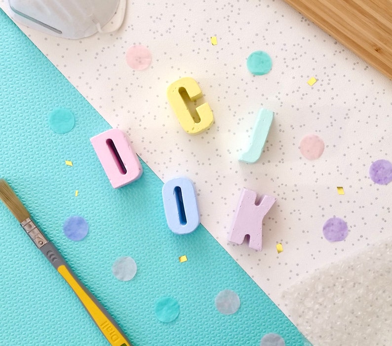
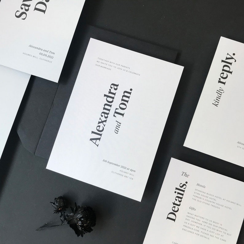
1. A COLORFUL pastel COLOR scheme
Pastels for me are always one of the first colors I think of when someone says spring colors!
They are fresh, fun and bright! While also being calm and not overpowering. Just like spring, itself! The perfect spring wedding colors.
Use a mix of around 4/6 colors. Try to keep them a similar tint. When working with any multicolored color scheme don’t go with primary colors unless wanting a very harsh, child party look.
Also, try to stay in very similar tones, shades or tints. This will create a balanced, stylish feel no matter the colors you pick or the amount.
For the mood board above we went very fun! Keeping it modern and stylish with with Matt colors and geometric shapes.
The flowers will bring texture and interest. Them and the geometric backdrop give a artistic feel to the look. keeping it high end and no chance of going tacky or childish!
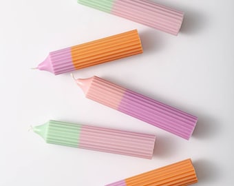
Sold on the pastel look? Then grab these items below to get designing the perfect spring look for your wedding.
SHOP THE LOOK NOW!


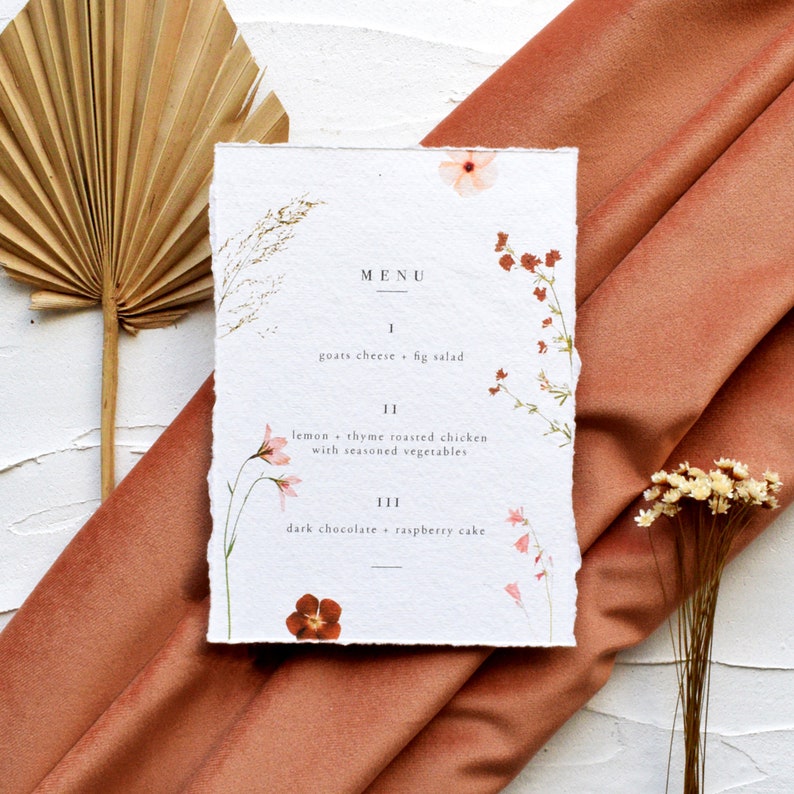
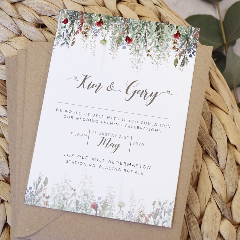
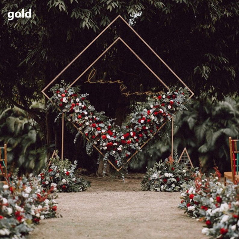
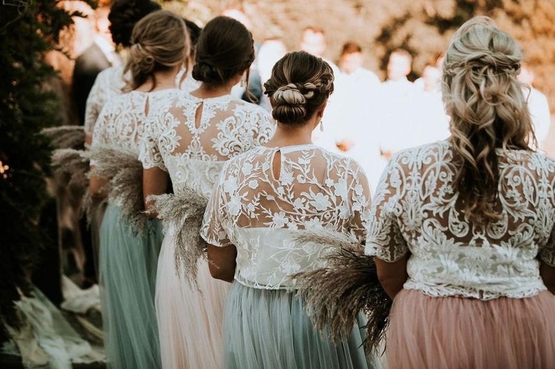
2. Spring Reds!
Using a mix of reds and pinks makes for the perfect red spring color scheme.
Lots of greenery works well to give it a lush organic spring feel. Work with a mixture of tones, shades and tints ranging from your darkest red to your lightest pink.
Using white as a base gives a clean fresh feel to the look. You can also use a really light pink, keeping it a monochromatic palette.
In the mood board below we have gone for a secret garden feel. Spring is the start of beautifully lush gardens and days spent enjoying the outdoors.
So what is better than a spring garden wedding theme. Lots of greenery and lush organic red and pink flowers to give a growing garden feel.

SHOP THE LOOK NOW!
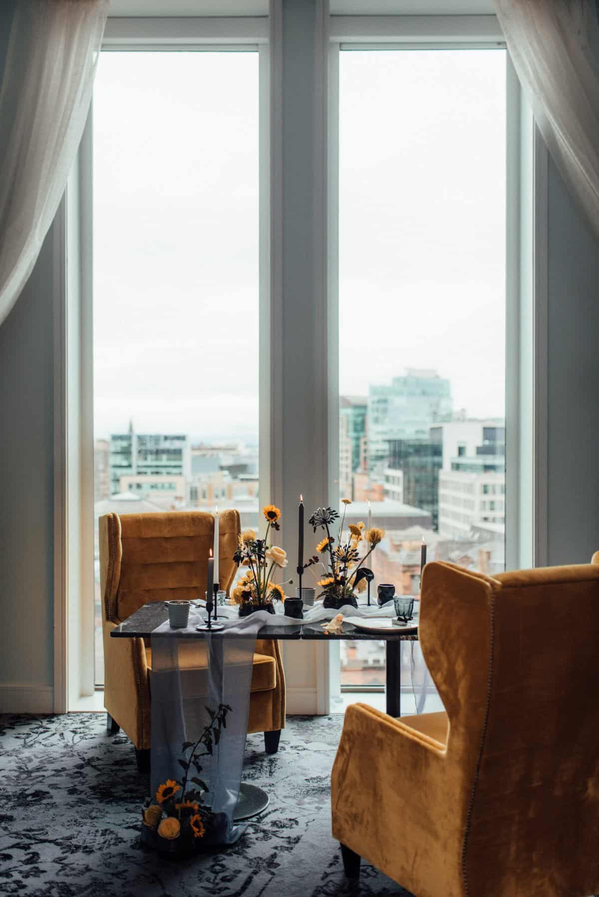
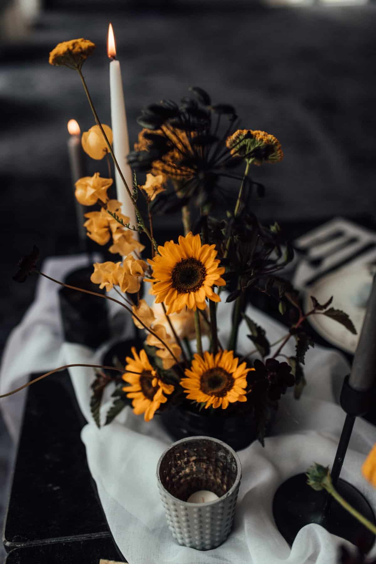
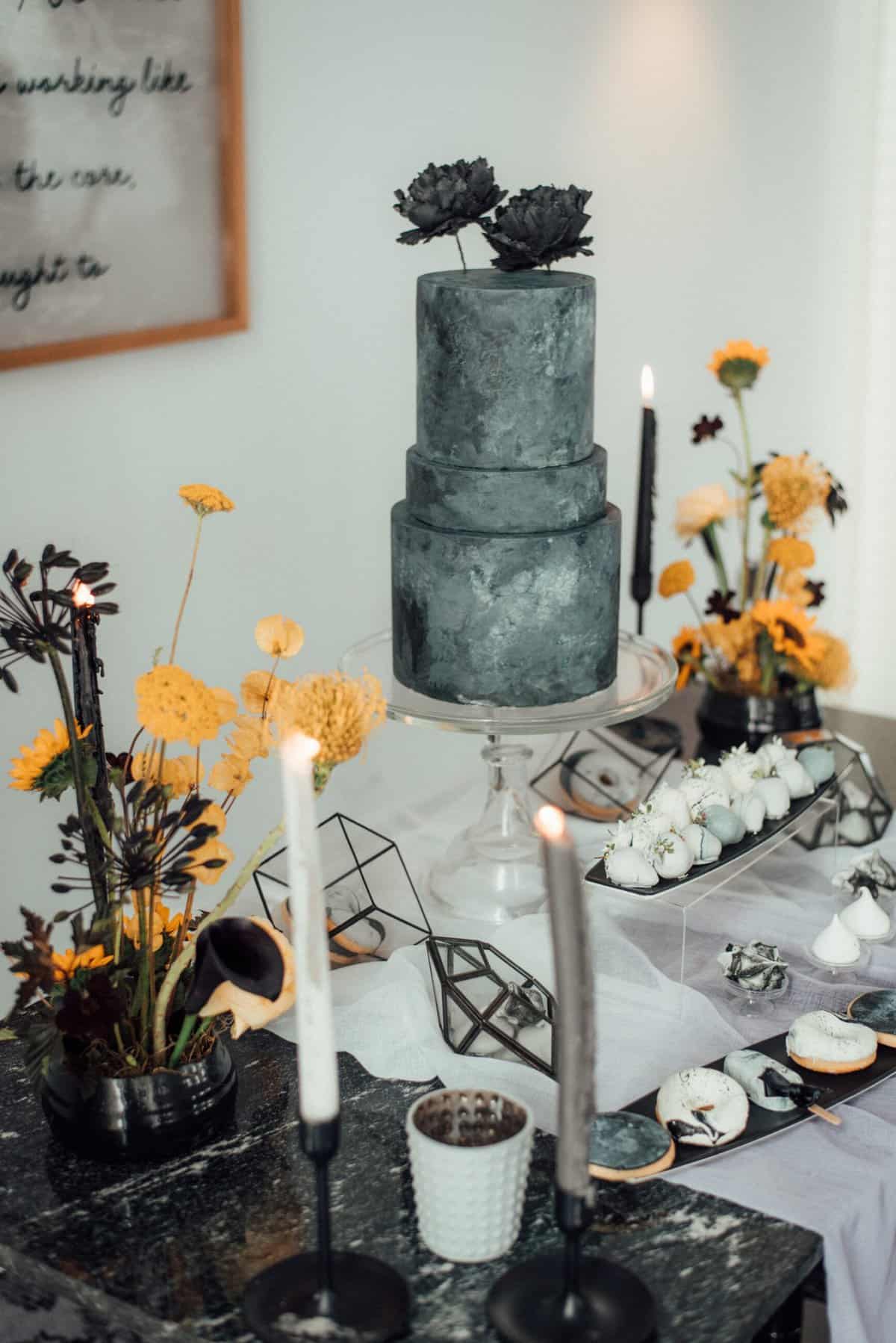
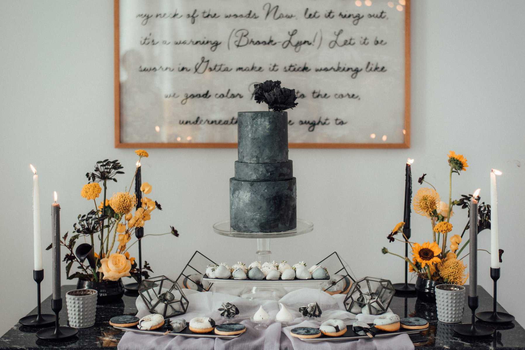
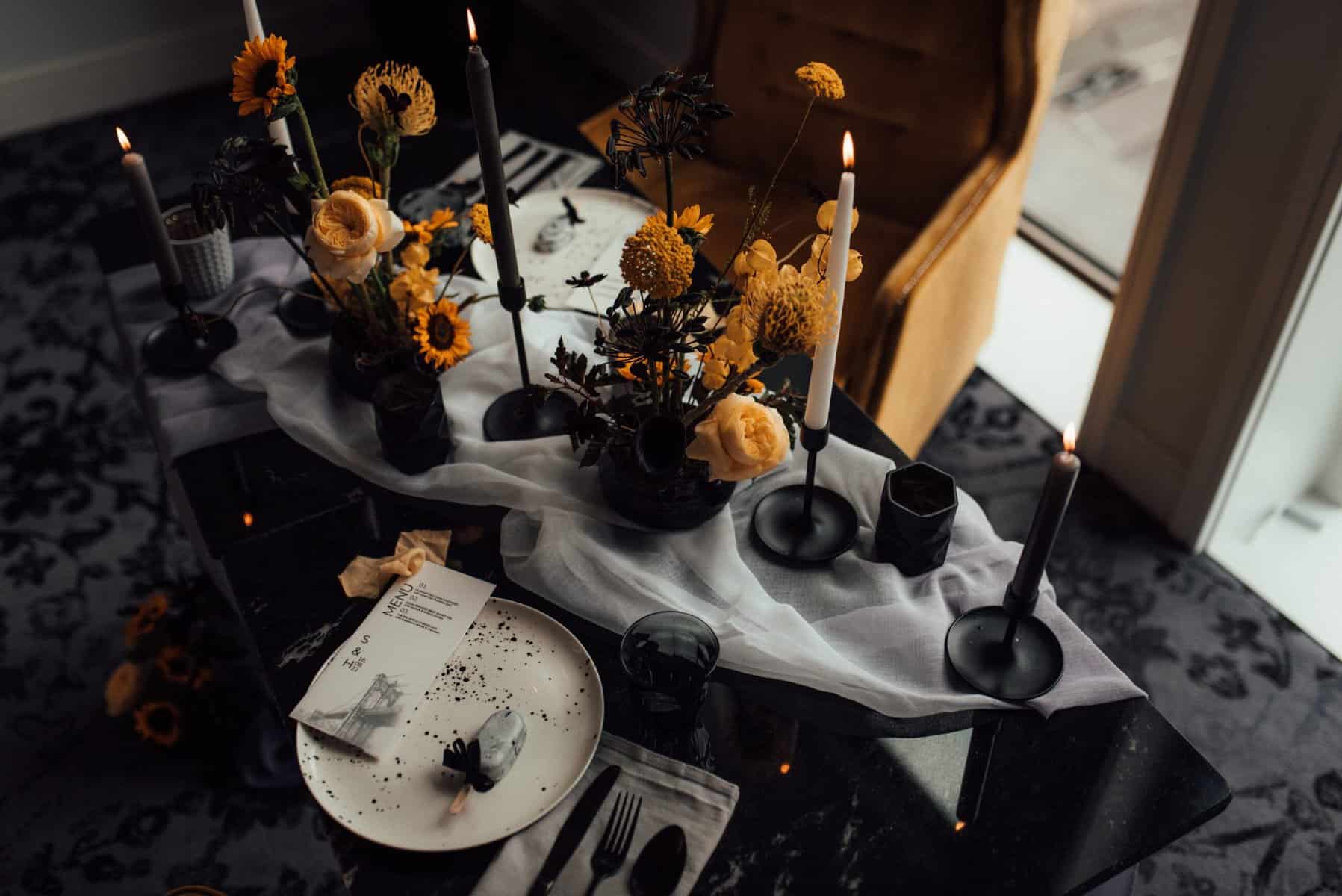
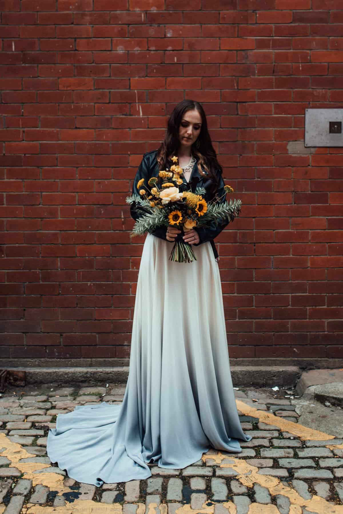
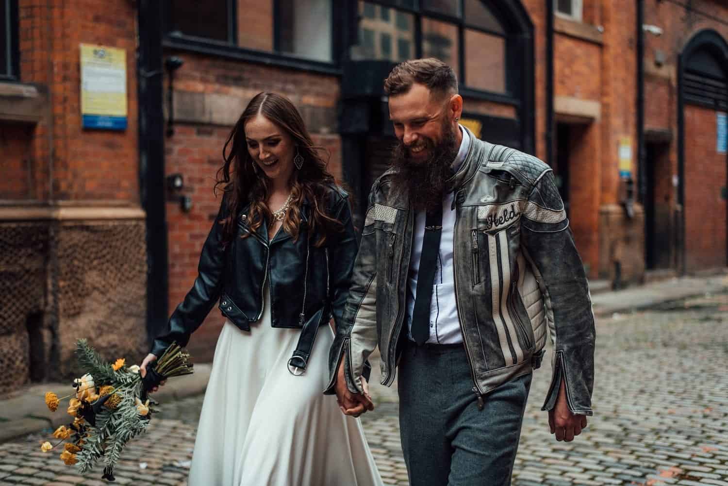
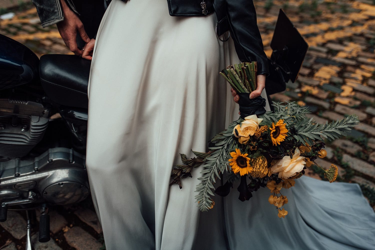
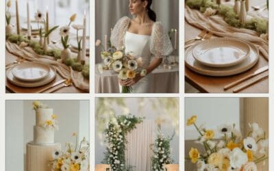
3. yellow spring color scheme
Pantone 2020 color of the year grey and yellow just got the ultimate upgrade!
Adding black and white to the colors creates the perfect uber-cool and insanely stylish modern yellow color scheme. We went all New York city street vibes with the mood board below.
Yellow alone is the perfect spring palette. Use a mix of yellow with white for crisp elegant feel. Or add some navy for a modern moody vibe.
Keep with toned down yellows or use a mustard shade. Primary yellow will give an Easter feel and will always look harsher with any color mix.


SHOP THE LOOK NOW!

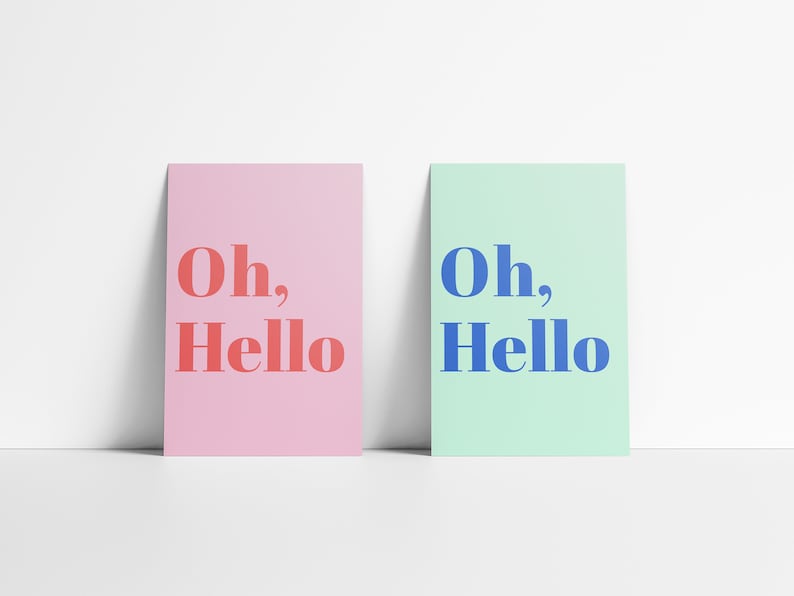
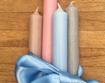
4. Pink and blue spring wedding!
A match made in spring heaven!
I love the fun fresh feel combining the right shades of pinks and blues gives.
Choosing your tints, shades and tones carefully is key to getting this palette right! Too close to primary colors and you will end up with a kids party or baby show feel to the day.
For the mood board below we wanted a really whimsical feel. Fun, modern and elegant. Using modern florals to keep it looking stylish. Also, keeping the colors toned down, Matt finishes!
Ready to get recreating this gorgeous color scheme? Then shop the items below.

SHOP THE LOOK NOW!
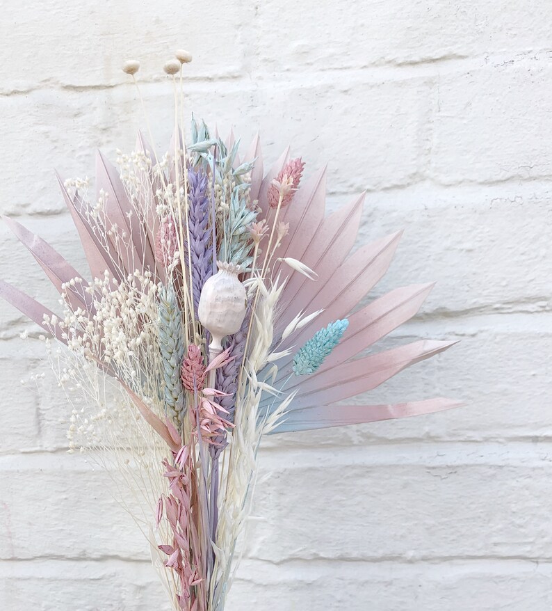
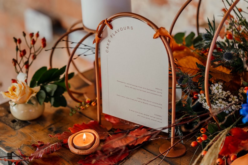
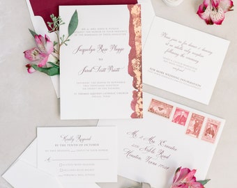
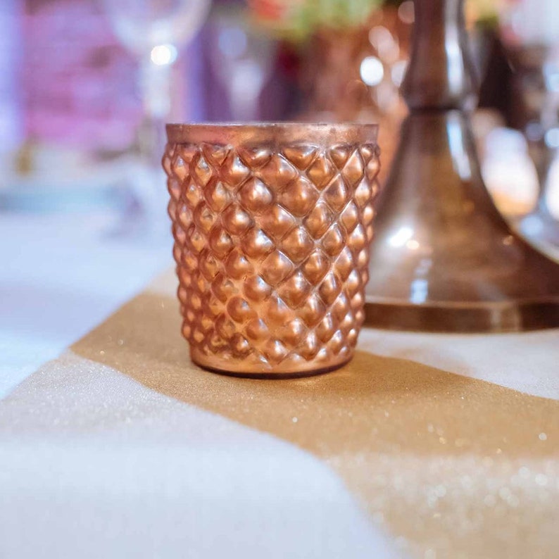
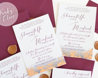
5. spring Copper and berry colors
I love to work with copper.
It warms up a palette, adds a modern feel and just works so well with most colors!
Mixing with light berry colors is the perfect spring palette!
In the mood board below I used a mixture of burgundy colors. I think of burgundy as a mix of purple and red. So spreading out to purple from red and with burgundy as the main focus gives a beautiful monochromatic feel to the color palette.

SHOP THE LOOK NOW!
Spring wedding color schemes
Still looking for more help and inspiration on spring wedding planning? Then head to our spring wedding guide.
More Spring blogs
Butter Yellow Nail Ideas Perfect for Weddings
Butter yellow nails are the unexpected trend we didn’t know we needed! They’re everywhere for...

Butter Yellow Wedding Guest Outfit Ideas: What to Wear & How to Style It
Butter yellow is everywhere right now, and it’s easy to see why. This soft, sunny shade is...
Butter Yellow Wedding Inspiration: Soft, Dreamy Ideas You’ll Love
The gorgeous soft buttery yellow is having a moment! Not just in weddings, it is the go-to color...

I fall love with these wedding color palette, Thanks for sharing.
thanks, glad you like them.